User Preference Study

Tapo Care Subscription
Page Preference Study

Seven executable design principles, based on Semantic Differential Scale

To inform the visual redesign of the Tapo Care subscription page, the UX Research team ran a Semantic Differential Scale study with 289 US users across 7 pairs of visual and information-architecture dimensions. The study used a dual-cohort inverse-validation design. V1 (matrix scale, n=253) and V2 (inverse slider, n=36) used opposite scale orientations, with V2 flipping V1's poles to detect hypothetical bias (the tendency for survey format itself to shape the answer). If preferences reverse between the two formats, the ratings are an artifact of the instrument; if they hold, the underlying signal is real. This report is built primarily around the open-ended responses. The quantitative ratings have real limitations: the same user often expresses conflicting preferences across dimensions, and a per-dimension preference bar can't reflect that tension. The open responses, in contrast, expose what users actually need and why.

The Pattern Beneath the Surface

Users showed seemingly conflicting preferences across three dimensions. They wanted detail (Simple vs Detailed), scenario context (Feature vs Scenario), and at the same time a visual-first layout that didn't drown them in text (Text vs Visual). The open responses suggest this is not a real contradiction. It's the same tension (information depth vs. scannability) surfacing in three different forms: depth should be reachable when users want it, but the default state shouldn't overwhelm them.

Taken together, these three needs point to a single design pattern: progressive disclosure, meaning a lightweight overview by default with deeper detail available when users ask for it. The Feature vs Scenario dimension shows a near-exact 50/50 split, so the recommendation is to keep feature lists and scenario examples side by side; the same progressive-disclosure logic can carry that pattern as well.

Across the open responses from all 7 dimensions, the most consistent themes are clear: users repeatedly value trust, control, transparency, and clarity, and they consistently reject manipulation, emotional pressure, and aggressive persuasion. This skepticism runs higher in a security-subscription context than in general consumer settings, because users are making decisions about their own safety and that of their families.

Mapped to each dimension: real photos build trust (Real Photos); intuitive design offers an efficient, predictable browsing path (Intuitive); side-by-side layouts reduce the memory load of comparing across screens (Comparative); progressive disclosure lets users themselves control information density (Simple vs Detailed, Feature vs Scenario, Text vs Visual); the choice between abstract and explicit framing is, in the end, a tradeoff between premium feel and clarity (Abstract vs Explicit).

1
Real Photos vs Illustrations
"Show me real homes, not stock art"
● Strong consensus
Principle
Use authentic home environment photography on the security subscription page. Avoid illustrations and AI-generated figures — realism is the foundation of trust, not an aesthetic preference.

Users' trust in a security product is built on authenticity. Most users explicitly stated that photos helped them assess whether the product was relevant to their own life. Opposition to real photos came primarily from privacy anxiety, not from an aesthetic preference for illustrations. This suggests "real photos" need not be literal photography — 3D renders, photorealistic illustrations, or lifestyle scene imagery can also qualify, as long as they convey a sense of real-world context. Avoid cartoonish or abstract vector-style figure illustrations.

Quantitative Distribution
V1 matrix (n=254)
35.4%
11.8%
52.8%
V2 slider (n=38)
65.8%
26.3%
Real Photos
Neutral
Illustrations
User Voices

"Because I can see real live video was actually going on I don't want to see a illustration"

Age 35–44Income Over $100,000Sub $30–$39.99V1 cohort

"I'd preferred the left description because the picture displays a realistic detail"

Age 45–54Income $50,000–$74,999Sub $40+V1 cohort

"Having real photos are usually way more appealing than just illustrations. It gives life to a page and makes it relatable"

Age 35–44Income Over $100,000Sub $20–$29.99V1 cohort

"Real photos seems more personal, more relatable."

Age 45–54Income Over $100,000Sub $20–$29.99V1 cohort

"I prefer the illustrated version more because the images make each function more understandable."

Age 35–44Income $25,000–$49,999Sub $30–$39.99V1 cohort

"Create an immediate connection with users by showing authentic, relatable visuals or products, people, or environments. They provide a realistic and tangible feel, making it easier for users to visualize the product or scenario in real life."

Age 35–44Income Over $100,000Sub $30–$39.99V1 cohort

"The feature focus was much easier to imagine due to real people. It made it easier to see your own life reflected."

Age 35–44Income $25,000–$49,999Sub Under $10V1 cohort

"real photos are important to me. It gives me a better visual of what is happening."

Age 35–44Income $75,000–$99,999Sub $10–$19V1 cohort

"I prefer illustrations over the images of real people"

Age 35–44Income Over $100,000Sub $10–$19V1 cohort

"I definitely prefer the real photos for security for my family"

Age 35–44Income $25,000–$49,999Sub $10–$19V1 cohort

"i feel like when you use real photos it could lead to a problem later on depending on wher the photos come from"

Age 35–44Income $50,000–$74,999Sub $10–$19V1 cohort

"real photos is easier to understand how it could be used in my life"

Age 25–34Income $75,000–$99,999Sub $20–$29.99V1 cohort

"I prefer the illustrations, it makes it more light hearted"

Age 25–34Income $25,000–$49,999Sub Under $10V1 cohort

"I prefer the real photos because they seem to fit the background better than illustrations and the illustration don’t look very well done to me. Those illustrations are very generic and lots of brand use them."

Age 18–24Income $25,000–$49,999Sub $10–$19V1 cohort

"Real photos allows me to connect with the product better."

Age 25–34Income Less than $25,000Sub Under $10V1 cohort

"i Prefer it because the real photos are more relatable to me."

Age 25–34Income $50,000–$74,999Sub $10–$19V1 cohort

"Illustration is better because it’s always fun to watch"

Age 25–34Income Over $100,000Sub Under $10V1 cohort

"Real photos make it feel that much more important"

Age 25–34Income $50,000–$74,999Sub $10–$19V1 cohort

"I prefer illustrations because I don't want to imagine someone else's family"

Age 18–24Income $50,000–$74,999Sub $20–$29.99V1 cohort

"It’s showing real moment with real people I prefer this to an illustration"

Age 25–34Income $50,000–$74,999Sub $10–$19V1 cohort

"real photos always make the product feel more real. some people like the color of illustrations but i like the personality of the real photos"

Age 18–24Income $50,000–$74,999Sub Under $10V1 cohort

"Illustrations best because it makes me not think about the camera recording me as well:"

Age 25–34Income $50,000–$74,999Sub $10–$19V1 cohort

"I like the illustrative one because it helps me focus better on the actual message and not so much on the photos."

Age 18–24Income $50,000–$74,999Sub $20–$29.99V1 cohort

"I think the real photos will be the audience feel more connected and draw them more into subscribing."

Age 25–34Income $25,000–$49,999Sub $20–$29.99V1 cohort

"The real photos were more engaging to me and I prefer the overall look of it"

Age 35–44Income Over $100,000Sub $30–$39.99V1 cohort

"I Prefer real photos. It’s easier to connect to"

Age 25–34Income Less than $25,000Sub $20–$29.99V1 cohort

"I slightly prefer the illustrations if you are going to use AI to make the photos"

Age 18–24Income Less than $25,000Sub $10–$19V1 cohort

"Its easier to visualize with real pictures"

Age 25–34Income $50,000–$74,999Sub $20–$29.99V1 cohort

"For a home security subscription, I think real photos works so much better because this is a system or devices used in someone's real home and it connects to the customer so much more when you see real people using it and it being used in real scenarios not illustrated ones"

Age 18–24Income Over $100,000Sub Under $10V1 cohort

"This make the app feel more realistic and trustworthy, especially for a home security product"

Age 25–34Income Over $100,000Sub $20–$29.99V2 cohort

"More realistic. Easier to see in my home"

Age 45–54Income Over $100,000Sub Under $10V2 cohort

"Illustration layout explains everything with both picture and words thereby eliminating room for confusion."

Age 35–44Income Over $100,000Sub $20–$29.99V2 cohort

"Definitely real photos, makes it seem less computer generated and more relatable"

Age 25–34Income Over $100,000Sub $10–$19V2 cohort

"Real photo increase trust and help us for make a perfect decision"

Age 35–44Income Over $100,000Sub $20–$29.99V2 cohort

"I prefer the real photos design for the subscription page. It will give me a sense of reality and help picture other people using similar security security service without feeling alone. It will make me feel assured being in touch with reality. So I would prefer real photos design on the page because it will make me feel safe and assured, and also create a relatable sense of things that feel very human."

Age 25–34Income $25,000–$49,999Sub Under $10V2 cohort

"I prefer the real photos. They feel more trustworthy and make the security features feel more real and relatable."

Age 25–34Income $75,000–$99,999Sub $10–$19V2 cohort

"Illustrations are easier to grasp. Models can be distracting."

Age 55–64Income $50,000–$74,999Sub $10–$19V2 cohort

"It’s what attracted me honestly to one of my cameras simply bc it represents the picture quality in a real life situation"

Age 45–54Income Less than $25,000Sub Under $10V2 cohort

"When comes to the trustworthy then real photo is the best option"

Age 35–44Income Over $100,000Sub $30–$39.99V2 cohort

"Illustrations are less distracting from the message. Photos are distracting."
Age 55–64Income $50,000–$74,999Sub Under $10V2 cohort
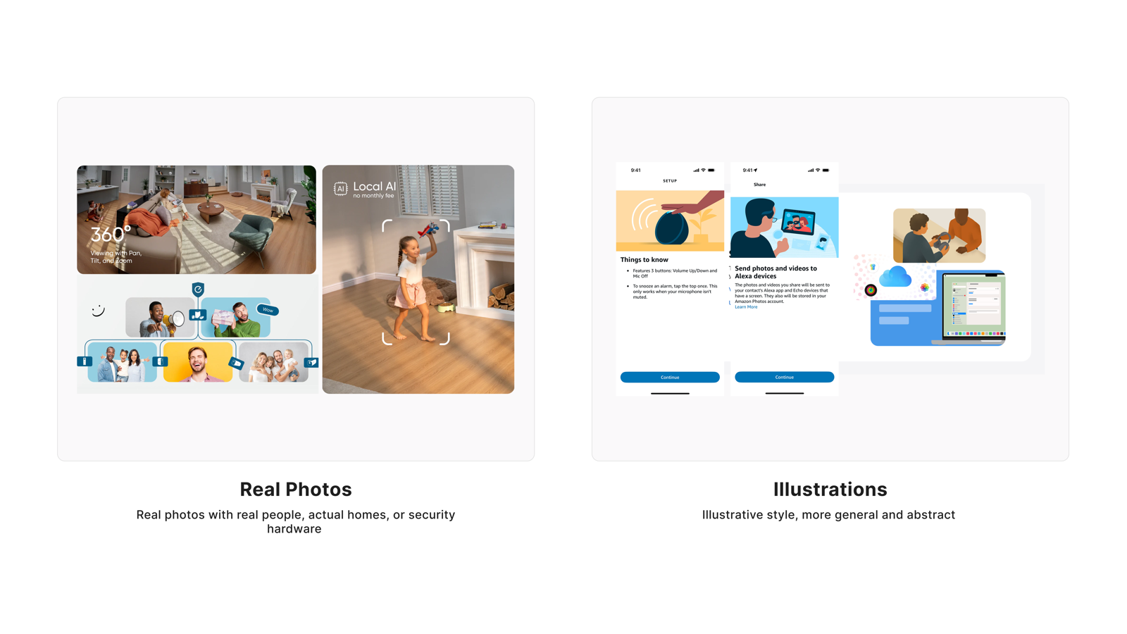
Visual Stimulus
Real Photos vs Illustrations design comparison
User Perspective
Why users prefer Real Photos
  • Makes the product feel credible and authentic — critical for a security context where trust is the primary purchase driver
  • Helps users assess whether the product fits their own home, lowering the decision barrier
  • More intuitive than illustrations — users can see actual installation states
  • Creates an immediate connection between user and product, supporting subscription intent
Why users dislike Real Photos
  • Viewing someone else's home creates psychological distance rather than relatability
  • Triggers privacy anxiety — a reminder that cameras record the user too
  • AI-generated "realistic" figures feel dishonest and can damage rather than build trust
  • Low-quality stock photography underperforms relative to intentionally designed illustrations
Researcher's Synthesis

Both cohorts show a strong, consistent preference for Real Photos over Illustrations.

Participants overwhelmingly prefer real photos for security and subscription products. Real photos make the product feel more realistic, relatable, trustworthy, authentic, and premium. They help users visualize the product in their own homes and feel more confident in their purchasing decision. Illustration supporters are a clear minority, with some preferring them to avoid distraction or because they find models unsettling.

Cohort 1's quantitative scale showed a moderate preference for Illustrations (55%), while Cohort 2's slider showed a strong preference for Real Photos (67%). The slider format likely reduced hypothetical bias, revealing the true preference. Which is consistently reflected in the qualitative comments across both cohorts.

Security interfaces should prioritize authentic, realistic imagery over illustrated or stylized alternatives. Real photos build trust and credibility which are critical factors when users are making decisions about personal safety and home protection.

Tapo Care's Design Response
  • Use authentic home environment product photography on the subscription page, showing devices in real installation contexts
  • Avoid real human faces or identifiable family members in photos — convey safety through spaces and devices themselves
  • Ensure image quality is high enough to distinguish product details; brand perception should convey security, reliability, and authenticity
  • Avoid stylized illustrations or AI-generated "realistic figures" as primary visuals
  • Photography should visually reinforce benefit descriptions, not serve as decorative background
Quant support: V1 matrix (n=254) favored Illustrations 52.8% / Real Photos 35.4%; V2 inverse slider (n=38) reversed significantly: Real Photos 65.8% / Illustrations 26.3%. The V1 vs V2 delta is substantial — one of 6 dimensions showing preference reversal — indicating V1 was influenced by hypothetical bias. V2 conclusion is the operative finding.
2
Intuitive vs Emotional
"Don't sell me, let me decide"
● Strong consensus
Principle
The subscription page's job is to help users decide — not to convince them that security matters. They already know. They don't need emotional language pushing them along.

Most users explicitly rejected emotional design, equating it with being manipulated. The minority who preferred emotional design, when read closely, were describing "scenario immersion" — not fear-based language.

Quantitative Distribution
V1 matrix (n=254)
35.0%
11.5%
53.5%
V2 slider (n=38)
68.4%
15.8%
15.8%
Intuitive
Neutral
Emotional
User Voices

"When it comes to making decisions, emotions is a good motivation."

Age 25–34Income $25,000–$49,999Sub $30–$39.99V1 cohort

"high quality experience easy to understand"

Age 35–44Income $75,000–$99,999Sub $20–$29.99V1 cohort

"I'd preferred the right description because it displays the emotions that lets me express my feelings"

Age 45–54Income $50,000–$74,999Sub $40+V1 cohort

"I prefer the one on the left this time because it feels like it give you a solution in making things easy. Efficiency is everything now a days especially for busy, working professionals."

Age 35–44Income Over $100,000Sub $20–$29.99V1 cohort

"I always prefer something that's a little bit more emotional and that you can connect to on a personal level"

Age 35–44Income Less than $25,000Sub $10–$19V1 cohort

"I like the intuitive version better because I prefer focusing on efficiency and knowing which tasks I've already completed."

Age 35–44Income $25,000–$49,999Sub $30–$39.99V1 cohort

"i like emotional one it have more new options which is very informative and easy to access"

Age 35–44Income Over $100,000Sub $20–$29.99V1 cohort

"I prefer the option that is intuitive because it can use past experiences to make more accurate decisions."

Age 45–54Income $50,000–$74,999Sub $20–$29.99V1 cohort

"People thrive off of emotion so that is a great one to have"

Age 25–34Income Over $100,000Sub $40+V1 cohort

"i prefer efficiency over having my emotions used"

Age 18–24Income Over $100,000Sub $40+V1 cohort

"It is better when it's intuitive focused"

Age 25–34Income $50,000–$74,999Sub $20–$29.99V1 cohort

"The quicker the better the only emotion I need is the one that has me persuaded to buy the packed anything other than that is a distraction and can lead to a potential loss of interest."

Age 18–24Income $25,000–$49,999Sub $20–$29.99V1 cohort

"I am goal oriented. When you focus on tasks and goals, it is more relevant to me."

Age 35–44Income $75,000–$99,999Sub $10–$19V1 cohort

"i want it to be intuitive so it's easy to use"

Age 45–54Income $25,000–$49,999Sub $10–$19V1 cohort

"Intuitive is better because I want to feel like I accomplished something rather than feeling something from the UI."

Age 25–34Income $25,000–$49,999Sub Under $10V1 cohort

"I prefer a more intuitive design because it makes it quick and easy to understand the plan and take action."

Age 25–34Income $50,000–$74,999Sub $10–$19V1 cohort

"Intuitive is better, emotions will distract my decision"

Age 18–24Income $50,000–$74,999Sub $20–$29.99V1 cohort

"i much prefer the intuitive design it’s simpler and gets me checked out"

Age 18–24Income $50,000–$74,999Sub Under $10V1 cohort

"honestly they seem to similar to compare. i don't think either is very emotional, so it's hard to tell the difference."

Age 18–24Income Less than $25,000Sub $10–$19V1 cohort

"I feel like the "emotional" one better delineates the differences in each type of plan and makes me more confident in what I'd be signing up for."

Age 25–34Income Less than $25,000Sub $30–$39.99V1 cohort

"I think the intuitive approach would be easier to understand"

Age 35–44Income Over $100,000Sub $30–$39.99V1 cohort

"I think this one heavily depends on the person but for me personally emotionally-centered works way better for me simply because it connects more to me and really makes me think about if the subscription is worth it to get, while the intuitive version just is not as enticing and I think of it more as a money grab"

Age 18–24Income Over $100,000Sub Under $10V1 cohort

"Intuition always because I want to get things done. I dont need any sugar coating f"

Age 25–34Income $50,000–$74,999Sub $20–$29.99V1 cohort

"It feels easier to navigate and makes it quicker to understand the subscription and take action."

Age 25–34Income Over $100,000Sub $20–$29.99V2 cohort

"I would prefer the intuitive side that shows more visuals that stand out but also gives the information I need in order to make the purchase that I need."

Age 18–24Income Less than $25,000Sub $20–$29.99V2 cohort

"I prefer efficient layouts, but I don't think the emotional design is inefficient."

Age 35–44Income $75,000–$99,999Sub Under $10V2 cohort

"I strongly prefer the intuitive design. It feels faster, cleaner, and easier to navigate without overthinking things."

Age 25–34Income $75,000–$99,999Sub $10–$19V2 cohort

"Emotional I much more preferred, it seems more personal"

Age 18–24Income Less than $25,000Sub $20–$29.99V2 cohort

"I think the amount of text is the thing that gets me again, it makes it very hard for me to want to understand and pay for something with so many words"

Age 25–34Income Over $100,000Sub $10–$19V2 cohort

"I am focused on efficiency so this is the reason I like them."

Age 35–44Income Over $100,000Sub $30–$39.99V2 cohort

"Making it intutive will allow user to select a plan quickly."

Age 55–64Income Over $100,000Sub $10–$19V2 cohort

"Emotional not appropriate for home security sales."

Age 55–64Income $50,000–$74,999Sub $10–$19V2 cohort

"The intuitive design concept looks far more calming than the emotional one."

Age 18–24Income Less than $25,000Sub Under $10V2 cohort
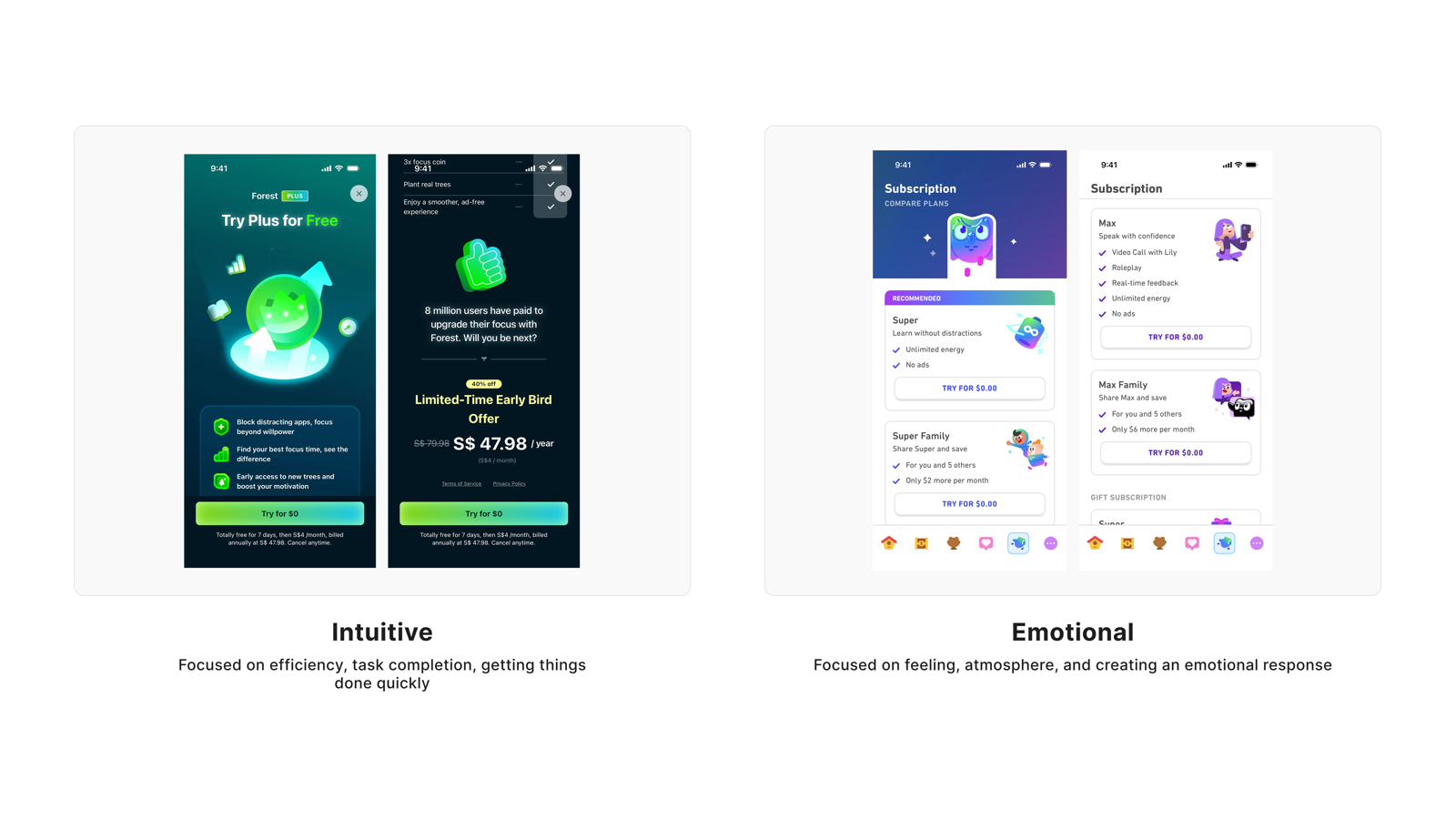
Visual Stimulus
Intuitive vs Emotional design comparison
User Perspective
Why users prefer Intuitive design
  • They arrive at the subscription page to complete a task, not to receive emotional guidance
  • They already understand the importance of security — they don't need to be persuaded again
  • Clear navigation is itself persuasive; efficiency builds trust
Why users dislike Emotional design
  • Feels manipulative — like being pushed into a decision rather than making one autonomously
  • Emotional copy often obscures information, leaving users unsure how to act
  • Fear-based language in a security context backfires, making users question brand motives
Researcher's Synthesis

Both cohorts show a strong, consistent preference for Intuitive over Emotional.

Users overwhelmingly prefer intuitive, functional, and efficient designs over emotional appeals for security and subscription products. Intuitive designs are valued for being easier to navigate, faster to understand, and more logical in flow. Emotional appeals are actively rejected by many as manipulative, aggressive, or inappropriate. With specific criticisms including "fear mongering" and "I don't want an app to pretend to have emotions."

Cohort 1's quantitative scale showed a slight Emotional preference (54%), while Cohort 2's slider showed a strong Intuitive preference (70%). The slider format may have reduced hypothetical bias, revealing the true preference. The qualitative comments across both cohorts, however, were unanimously clear: Intuitive wins.

Security and subscription products should prioritize intuitive usability over emotional connection. Emotional appeals risk backfiring, reading as inauthentic or pressuring. Users want efficiency, directness, and logical flow - not feelings.

Tapo Care's Design Response
  • Information hierarchy is clear — users can locate plan comparison and key pricing within 5 seconds
  • Copy directly describes benefits; no fear or anxiety language (e.g., "your home is at risk")
  • Subscription and cancellation paths are transparent; avoid hidden interactions or forcing users to scroll to see complete information
  • Avoid manufactured urgency through exaggerated threat scenarios; frame around "what you can do" rather than "what happens if you don't subscribe"
Quant support: V1 matrix (n=254) favored Emotional 53.5% / Intuitive 35.0%; V2 inverse slider (n=38) reversed dramatically: Intuitive 68.4% / Emotional 15.8%. This is the strongest V1 vs V2 reversal of all 7 dimensions — preference direction nearly completely inverted. V2 + qualitative double alignment is the operative finding.
3
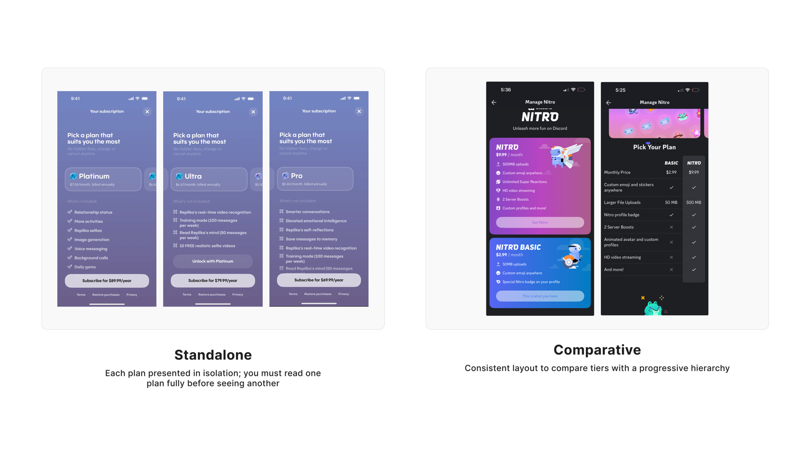
Standalone vs Comparative
"Let me see plans side by side"
● Strong consensus
Principle
Present subscription plans side by side by default, so users can grasp differences at a glance — navigating back and forth is not just inconvenient, it makes users feel the system is deliberately hiding information.

This is the strongest consensus across all 7 dimensions. Users' demand for side-by-side comparison stems from decision efficiency, not visual preference — they know they need to compare, and back-and-forth navigation interrupts that judgment process.

Quantitative Distribution
V1 matrix (n=254)
72.0%
20.1%
V2 slider (n=38)
60.5%
36.8%
Comparative
Neutral
Standalone
User Voices

"A stand alone option is more easier for me to access and not mix up"

Age 25–34Income $25,000–$49,999Sub $30–$39.99V1 cohort

"I like the one in the right because you get to easily compare plans by just looking at it"

Age 35–44Income Over $100,000Sub $20–$29.99V1 cohort

"It’s easier to digest the info, the other “standalone” option on the left is boring"

Age 45–54Income Less than $25,000Sub $10–$19V1 cohort

"It's easier to compare side by side then to have to remember what the previous one said."

Age 45–54Income $50,000–$74,999Sub Under $10V1 cohort

"I would like side-by-side comparisons so that I can better make a decision."

Age 45–54Income Over $100,000Sub $20–$29.99V1 cohort

"Comparative makes me feel more comfortable"

Age 35–44Income $50,000–$74,999Sub $20–$29.99V1 cohort

"It is easier to read this compared to the left."

Age 25–34Income $50,000–$74,999Sub $20–$29.99V1 cohort

"I would only want information for one home security app because it would be too cluttered and confusing to compare different options on the same home page."

Age 35–44Income $25,000–$49,999Sub $30–$39.99V1 cohort

"i strongy prefer the comparative design because it allows users to easily compare"

Age 35–44Income Over $100,000Sub $20–$29.99V1 cohort

"The standalone design allows each plan to be viewed individually, giving users the space to read and consider each option thoroughly without distraction. It keeps the layout simple and focused, which great for users who prefer to make decisions based on one plan at a time."

Age 35–44Income Over $100,000Sub $30–$39.99V1 cohort

"I prefer the comparative version so I can make my decision faster."

Age 45–54Income Over $100,000Sub $30–$39.99V1 cohort

"Very easy to understandable for make comparisons and make decisions properly"

Age 35–44Income Over $100,000Sub $30–$39.99V1 cohort

"I like both options a lot but lean a little more towards comparative because you can see the side to side comparison of plans so you know what is actually going to meet your needs"

Age 35–44Income $25,000–$49,999Sub Under $10V1 cohort

"the way they make by comparison and standalone is so much easier to understand"

Age 45–54Income $75,000–$99,999Sub $10–$19V1 cohort

"it help to decide fast interface is easy to understand"

Age 18–24Income $75,000–$99,999Sub $20–$29.99V1 cohort

"Standalone is less cluttered and easier to read."

Age 25–34Income $25,000–$49,999Sub $10–$19V1 cohort

"I like the comparative because I can easily compare the different plans and choose what works for me"

Age 25–34Income $25,000–$49,999Sub Under $10V1 cohort

"I like comparative’s simplicity but thoughtful layout. It’s interesting to lookout without feeling overwhelming and cluttered."

Age 25–34Income $25,000–$49,999Sub Under $10V1 cohort

"When it comes to pricing being able to see all at once and their benefits helps me choose"

Age 25–34Income Less than $25,000Sub Under $10V1 cohort

"I really liked the comparative layout because it makes it easy to compare plans side-by-side and understand the differences in features and pricing."

Age 25–34Income $50,000–$74,999Sub $10–$19V1 cohort

"Standalone is a lot easier to process quicker"

Age 18–24Income $50,000–$74,999Sub $20–$29.99V1 cohort

"I want to see all my options right up front with a way to easily compare them. Stand alone feels time wasting and unnecessarily annoying to use."

Age 18–24Income Over $100,000Sub $10–$19V1 cohort

"I prefer the comparative because the charge is monthly not yearly"

Age 25–34Income $50,000–$74,999Sub $10–$19V1 cohort

"Having all options at once to compare helps make a decision better. Having to go back and forth is too much of a hassle."

Age 25–34Income $25,000–$49,999Sub $20–$29.99V1 cohort

"I prefer comparative because it allows me to make a more informed decision"

Age 35–44Income Over $100,000Sub $30–$39.99V1 cohort

"I like the on on the right because I can see the comparison of all the plans"

Age 25–34Income Over $100,000Sub $10–$19V1 cohort

"I prefer the one on the right a little bit since it is easier to compare"

Age 25–34Income Over $100,000Sub Under $10V1 cohort

"Definitely prefer the comparative design on the right just because they both are listing out the things you get from each level of subscription the only issue is that in the stand alone you normally have to read through all of them and decipher the differences such as what is missing from each while in the chart setup for comparative is very clear what you do and don't get in the different subscription models"

Age 18–24Income Over $100,000Sub Under $10V1 cohort

"It’s easier to view the image compared to the other"

Age 25–34Income $50,000–$74,999Sub $20–$29.99V1 cohort

"I would go with comparative because it makes it easier to compare the different plans side by side and quickly see the differences between them"

Age 25–34Income Over $100,000Sub $20–$29.99V2 cohort

"I need something that’s at first glance just shows me what includes and doesn’t include and I feel like the comparison is really great at that"

Age 25–34Income Over $100,000Sub $10–$19V2 cohort

"I would prefer the comparative subscription that shows the different plans side by side and shows waht benefits offer what for aa certain price and time."

Age 18–24Income Less than $25,000Sub $20–$29.99V2 cohort

"Comparative one seems to be helpful when deciding what does I need and what should I choose."

Age 35–44Income Over $100,000Sub $30–$39.99V2 cohort

"when looking at plans the user should be able to compare easily rater than work hard to remember what they saw on other screen"

Age 55–64Income Over $100,000Sub $10–$19V2 cohort

"I prefer the comparative design. I like this design because at first glance, I can see the benefits of both offers and decide on which one I would like to pay for without it feeling like stress. I like that at first glance the features available and the features not available for each subscription can be noted with ease compared to having to read the whole page and mentally noting the offers down before a decision is reached."

Age 25–34Income $25,000–$49,999Sub Under $10V2 cohort

"I prefer the comparative layout because it makes it easier to compare plan side by side without flipping through screens."

Age 25–34Income $75,000–$99,999Sub $10–$19V2 cohort

"While the standalone looks okay, I prefer the comparative better because it summarizes and compares the features of what it has to offer."

Age 18–24Income Less than $25,000Sub Under $10V2 cohort

"Standalone looking like very organized and easy to understandable"

Age 35–44Income Over $100,000Sub $30–$39.99V2 cohort
Visual Stimulus
Standalone vs Comparative layout comparison
User Perspective
Why users prefer Comparative layout
  • All tiers visible on one screen — high scan efficiency
  • Differences are immediately apparent without relying on memory
  • Back-and-forth navigation interrupts the decision flow and creates suspicion that information is being hidden
Why users prefer Standalone layout
  • Each plan has sufficient space for deeper presentation without crowding
  • Allows focus on one plan without distraction from other options
  • Information hierarchy feels clearer — stronger sense of understanding each item in sequence
Researcher's Synthesis

Both cohorts show a strong, consistent preference for comparative layout over standalone.

Participants overwhelmingly prefer side-by-side comparison formats for evaluating subscription plans. The comparative layout reduces cognitive load by eliminating the need to remember information across screens, enables faster decision-making, and clearly shows what is included or excluded. A small minority prefers standalone for its focused, less cluttered presentation, but the consensus across both cohorts is clear: users want to see options together, not separately.

Cohort 1 more explicitly noted that standalone reduces "pressure to decide," while Cohort 2 more heavily emphasized efficiency and visual appeal. The core preference for comparative remains unchanged."

Subscription plan selection interfaces should use side-by-side comparative layouts as the default. Standalone layouts may be offered as an alternative for users who prefer focused review, but the primary experience should support simultaneous comparison.

Tapo Care's Design Response
  • Subscription plans are displayed side by side by default, with feature differences visible on the same screen
  • Clearly mark inclusions and exclusions for each plan, with differentiation points prominently highlighted
  • Recommended plan is guided through visual hierarchy rather than forced modals — user agency is preserved
  • Comparison table maintains adequate row spacing and white space to avoid information density overload
  • Consider offering a "single-plan focus" view as a secondary entry point, but do not use it as the default
Quant support: V1 matrix (n=254) favored Comparative 72.0% / Standalone 20.1%; V2 inverse slider (n=38) favored Comparative 60.5% / Standalone 36.8%. The most directionally stable of all 7 dimensions — V1 and V2 align, with consistent preference for Comparative across all age groups, income levels, and subscription tiers. No significant cohort variation.
4
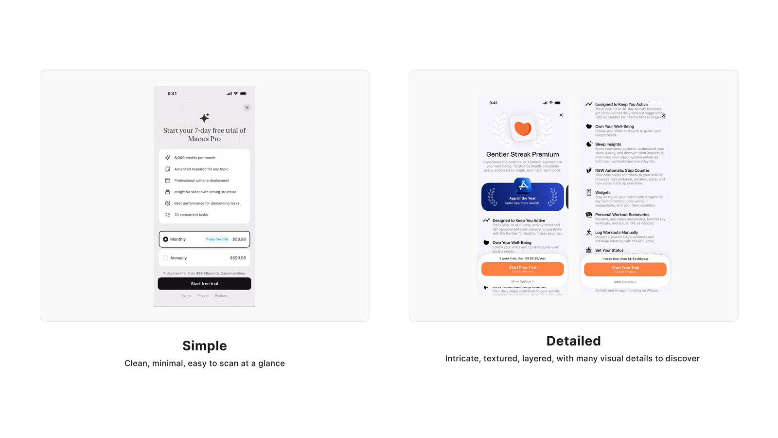
Simple vs Detailed
"I want detail, but don't drown me"
● Medium consensus
Principle
Users don't want less information — they want it available when they're ready for it. Progressive disclosure is the answer that satisfies users on both ends of the spectrum.

This dimension is the core evidence for the meta-insight. Users on both ends have compelling reasons: the simple version avoids information overload, while the detailed version provides trust signals and decision support. Quantitative data shows the largest V1/V2 reversal — but qualitative data reveals the truth: the question isn't which side to choose, but how to design the information hierarchy.

Quantitative Distribution
V1 matrix (n=254)
24.8%
68.5%
V2 slider (n=38)
55.3%
36.8%
Simple
Neutral
Detailed
User Voices

"I really like the simple option. The detailed one is too overwhelming!"

Age 45–54Income Over $100,000Sub $30–$39.99V1 cohort

"I like the simple menu so that the information stands out."

Age 35–44Income Over $100,000Sub $30–$39.99V1 cohort

"A detailed information helps me make my decisions faster"

Age 25–34Income $25,000–$49,999Sub $30–$39.99V1 cohort

"I wanted detailed description because I want to know all the capabilities of the product I bought"

Age 35–44Income Over $100,000Sub $30–$39.99V1 cohort

"The simpler one on the left looks more appealing and the other one looks cluttered, but it's important to have as much information as possible"

Age 45–54Income Over $100,000Sub $20–$29.99V1 cohort

"I'd preferred the left description because it is in more detail which makes it easier to install"

Age 45–54Income $50,000–$74,999Sub $40+V1 cohort

"I prefer the detailed one as it clearly shows you what you’re paying for."

Age 35–44Income Over $100,000Sub $20–$29.99V1 cohort

"As a beginner I prefer the simple one so I can understand it better"

Age 45–54Income $25,000–$49,999Sub Under $10V1 cohort

"I like details to be available if needed, but when taking quick glances I would prefer the basics (simple)."

Age 45–54Income Over $100,000Sub $20–$29.99V1 cohort

"I like this version more simply because it provides me with a lot more detail."

Age 35–44Income $25,000–$49,999Sub $30–$39.99V1 cohort

"The right has more bold and with more details"

Age 35–44Income $50,000–$74,999Sub $40+V1 cohort

"I prefer to have less on the screen so it isn't so cluttered."

Age 45–54Income $25,000–$49,999Sub $20–$29.99V1 cohort

"i prefer the detailed deign because it provides more information about features"

Age 35–44Income Over $100,000Sub $20–$29.99V1 cohort

"The simple design offers a clean, minimal layout that is easy to scan quickly. It focuses on the core elements, like the trial offer, subscription options, and key features, making it straightforward user experience."

Age 35–44Income Over $100,000Sub $30–$39.99V1 cohort

"The simple version would catch my attention right away, where as, the detailed version would make me pass it up."

Age 45–54Income Over $100,000Sub $30–$39.99V1 cohort

"I prefer the simple version because it's easier to understand."

Age 45–54Income $25,000–$49,999Sub $20–$29.99V1 cohort

"The simple version is easier to read. The detail version is very congested with information."

Age 45–54Income $50,000–$74,999Sub $20–$29.99V1 cohort

"I think when you add too much verbiage you lose the customer because it is overwhelming and they are looking for quick information"

Age 25–34Income Over $100,000Sub $40+V1 cohort

"for at a glance information i prefer simple but for more explanation i would want detailed it just depends on the situation"

Age 18–24Income Over $100,000Sub $40+V1 cohort

"I like the detailed one because it is more appealing and has more information"

Age 25–34Income $50,000–$74,999Sub $30–$39.99V1 cohort

"Easier to get me to impulsively subscribe e too much text gives me too much time to debate the plan."

Age 18–24Income $25,000–$49,999Sub $20–$29.99V1 cohort

"I like having more information, but worry that this one may be a little too much clutter"

Age 35–44Income $50,000–$74,999Sub Under $10V1 cohort

"I prefer to see detailed things that are available to me in the app."

Age 45–54Income $75,000–$99,999Sub $10–$19V1 cohort

"I really like detailed because then i can choose exactly what i want to focus on versus having to go and find that infroamtion"

Age 35–44Income $50,000–$74,999Sub $10–$19V1 cohort

"I like the simplicity of the L design. The right is overwhelming"

Age 25–34Income $75,000–$99,999Sub $20–$29.99V1 cohort

"The detailed design is too much information to take in at once"

Age 25–34Income $25,000–$49,999Sub Under $10V1 cohort

"The simple design is WAY more inviting, all the wording for the detailed design makes me want to skip and not read it all. It’ll overwhelm the user if the detailed designed is used. Simple is to the point and easy on the eyes."

Age 25–34Income $25,000–$49,999Sub Under $10V1 cohort

"I chose 1 because I prefer the simpler design on the left. It feels cleaner and easier to understand without unnecessary details."

Age 18–24Income Over $100,000Sub $20–$29.99V1 cohort

"I feel like the detailed version looks a lot better, because speaking for myself, I’d like to learn more about the subscription before I actually pay for it. I want to know all the perks and what’s included."

Age 18–24Income $25,000–$49,999Sub $10–$19V1 cohort

"I prefer things to be easy to glance and find than having to read and get more confused"

Age 25–34Income Less than $25,000Sub Under $10V1 cohort

"I prefer the simple design because it is easier to scan quickly and feels less overwhelming. Basically, for a security subscription page, I want the price, benefit and action button to be clear without too many visuals."

Age 25–34Income $50,000–$74,999Sub $10–$19V1 cohort

"Having it more detailed makes me believe it is more legit / worth my money."

Age 18–24Income Over $100,000Sub Under $10V1 cohort

"I prefer the detailed one, it is very nice and well detailed. it is also very attractive"

Age 35–44Income Over $100,000Sub $30–$39.99V1 cohort

"I like a simpler straight to the point demonstration"

Age 25–34Income $50,000–$74,999Sub $10–$19V1 cohort

"It feels more professional, less overwhelming, and visually appealing."

Age 18–24Income Over $100,000Sub $10–$19V1 cohort

"I prefer the right description because it is well detailed so it’s way to decide to subscribe without thinking so too long"

Age 25–34Income $50,000–$74,999Sub $10–$19V1 cohort

"personally i prefer the more concise but descriptive simple definition. the more complex one is just too messy"

Age 18–24Income $50,000–$74,999Sub Under $10V1 cohort

"i feel like the detailed screen has too much information. i want the initial screen to be more sleek and then i would like to see more information on future pages."

Age 25–34Income Less than $25,000Sub $30–$39.99V1 cohort

"I like the detailed option because of the colors and fun options. But I like how simple the first one is."

Age 25–34Income $50,000–$74,999Sub $10–$19V1 cohort

"I like the simpler version better. It's concise and easy to read. Just include all important details and keep it miminal. No one reads through big paragraphs."

Age 18–24Income $50,000–$74,999Sub $20–$29.99V1 cohort

"I like how simple this plan and subscription idea is. If I am paying for a subscription I want it to be straightforward without way too much information. I want it to give me my options and then I choose from those"

Age 18–24Income Less than $25,000Sub $10–$19V1 cohort

"The detailed one has too much information and can lose the reader."

Age 25–34Income $25,000–$49,999Sub $20–$29.99V1 cohort

"I felt the simple was easier to understand so I prefer it"

Age 35–44Income Over $100,000Sub $30–$39.99V1 cohort

"It looks nice and sleek without doing too much"

Age 25–34Income Less than $25,000Sub $20–$29.99V1 cohort

"It’s not too much information, it is digestible. Maybe is there was a more section the second would be a nice option"

Age 18–24Income Less than $25,000Sub $10–$19V1 cohort

"I don’t like paying for things that give me overwhelming information. The one on the left is simply and tells me what I need to know"

Age 25–34Income Over $100,000Sub $10–$19V1 cohort

"I prefer the simple one since it is easier to pick out the key information nd make a decision."

Age 25–34Income Over $100,000Sub Under $10V1 cohort

"design of image on the right has way too much information for when I want to get a subscription, I very much prefer the simple layout because I can quickly know what i get out of the subscription and how much it costs and than if I want to learn more I could research the subscription on my own but on initial view of subscription I do no need to see all the detailed information it is overwhelming to read through and would deter me from purchasing the subscription"

Age 18–24Income Over $100,000Sub Under $10V1 cohort

"I prefer the simple description because it is straightforward and to the point"

Age 25–34Income $50,000–$74,999Sub $20–$29.99V1 cohort

"I like it simple and straight to the point"

Age 25–34Income $50,000–$74,999Sub $20–$29.99V1 cohort

"I think it provides more details about what you are getting and a brief description of each which would help in the decision process"

Age 55–64Income $50,000–$74,999Sub $10–$19V2 cohort

"It feels cleaner, easier to read and quicker to understand without too much information on the screen"

Age 25–34Income Over $100,000Sub $20–$29.99V2 cohort

"The simple description is straight to the point and catchy."

Age 35–44Income Over $100,000Sub $20–$29.99V2 cohort

"I prefer to be detailed one because I need to know what I am paying for and what I am getting."

Age 35–44Income Over $100,000Sub $30–$39.99V2 cohort

"The right side is overwhelming. When creating a trial period or a subscription, less is more."

Age 25–34Income Over $100,000Sub $10–$19V2 cohort

"I like being able to see a detailed version if I have questions, but I prefer simple by default. Most times it's already a pain to set up a new account or subscription, I want the process to be as quick as possible."

Age 35–44Income $75,000–$99,999Sub Under $10V2 cohort

"I lean towards the simple design because it feels cleaner, easier to scan, and less overwhelming for a security app."

Age 25–34Income $75,000–$99,999Sub $10–$19V2 cohort

"I believe the detailed description takes a lot of the guesswork out and gives a user much more information."

Age 55–64Income Over $100,000Sub $20–$29.99V2 cohort

"It’s simple yet to the point the other looks to busy that it might be confusing"

Age 45–54Income Less than $25,000Sub Under $10V2 cohort

"I strongly prefer the left description because it is more detailed than the one on the right. It also has eye-catching colors. It lists the complete details that the user may want to know."

Age 18–24Income Less than $25,000Sub Under $10V2 cohort

"I was overwhelmed with the details. I want to start simple."

Age 55–64Income Over $100,000Sub $10–$19V2 cohort

"simple design actually seems very attractive and trustworthy. I prefer this"

Age 35–44Income Over $100,000Sub $30–$39.99V2 cohort

"Frankly, I want the simple one to figure out if I want it or not, then a more detailed version to "finalize" whether I really want it or not. I LIKE the detail to be available, but hitting me with it first is overwhelming. If I decide that there's something I might need, then I can see myself reading the detail before buying"

Age 55–64Income $50,000–$74,999Sub Under $10V2 cohort
Visual Stimulus
Simple vs Detailed information density comparison
User Perspective
Users who prefer Simple value
  • Scan efficiency — capturing key information at a glance
  • Information overload directly triggers avoidance; more words means nothing gets read
  • Don't want to be bombarded with information before deciding whether they're interested
  • (More common among ages 25–34, habitual fast-scanners)
Users who prefer Detailed value
  • Knowing what they're buying — more transparency equals more trust
  • Detail is a trust signal that actually helps them decide faster
  • Need complete information to feel confident enough to subscribe
  • (More common among ages 35+, users who need more context to form a judgment)
Researcher's Synthesis

Both cohorts show a clear qualitative preference for simplicity over detail, despite quantitative differences.

Participants consistently prefer simple, scannable information that is efficient and not overwhelming. Dense text creates friction, cognitive load, and disengagement. While detailed descriptions are valued for informed decision-making, the default preference across both cohorts is for clarity, ease of use, and quick overviews. This is especially trie for subscription and security products.

Cohort 1 (matrix) showed a slightly stronger expressed appreciation for detail in comments, whereas Cohort 2 (slider) more uniformly rejected text-heavy presentations as "overwhelming" or "boring."

Subscription and security interfaces should prioritize simplicity and scannability. Detailed information should be available but not presented as the default. Use progressive disclosure to keep the primary experience clean and efficient.

Tapo Care's Design Response
  • Above-the-fold content uses concise benefit cards — scannable text, no paragraph-style explanations
  • Provide "Learn more" or expandable entry points, letting users who need detail access it proactively
  • Benefit items use short phrases, prioritizing keywords over complete sentences
  • Expanded detail sections maintain clear information hierarchy and don't compete with the main flow for visual attention
  • 35+ user path: ensure detail entry points are prominent enough that users don't need to "guess" whether more information exists
Quant support: V1 matrix (n=254) favored Detailed 68.5% / Simple 24.8%; V2 inverse slider (n=38) reversed: Simple 55.3% / Detailed 36.8%. Significant age effect: 35+ favored Detailed 74.7% vs <35 only 59.0% (15.7pp gap) — strong evidence supporting a progressive disclosure strategy.
5
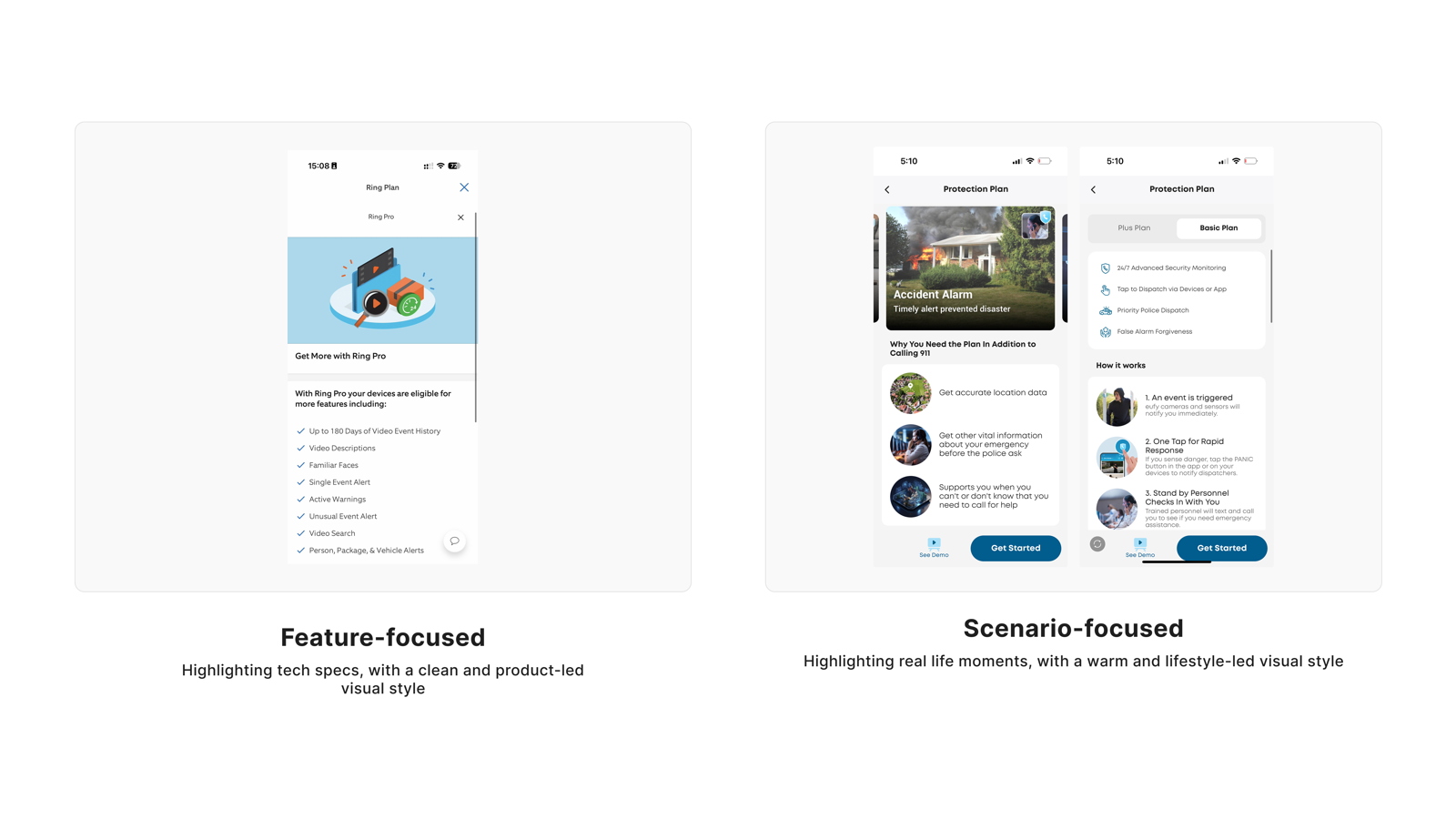
Feature vs Scenario
"Tell me what I'm paying for"
● Split (50/50)
Principle
Feature lists and scenario examples are both answering the same question — "what am I getting?" They are not competing formats; they are different entry points into the same user need.

V2 data is an exact 50/50 split — not because users have no preference, but because the user population contains two distinct groups, each building their judgment through a different path. The age difference is significant: users 35+ skew toward Scenario, those under 35 skew toward Feature. The design answer is to include both, using information hierarchy to let each user follow their own path deeper.

Quantitative Distribution
V1 matrix (n=254)
28.3%
11.5%
60.2%
V2 slider (n=38)
47.4%
47.4%
Feature
Neutral
Scenario
User Voices

"The list of features is much easier to process than the scenario-focused one."

Age 45–54Income Over $100,000Sub $30–$39.99V1 cohort

"When choosing a product initially, I am more focused on the features more so than the scenarios"

Age 35–44Income $25,000–$49,999Sub $20–$29.99V1 cohort

"I'd preferred the right description because it displays the features that are focused which is easier to install"

Age 45–54Income $50,000–$74,999Sub $40+V1 cohort

"Scenario based because accidents or other events could happen and this is a good insurance policy"

Age 35–44Income $50,000–$74,999Sub Under $10V1 cohort

"feature focus is very important for this"

Age 35–44Income Over $100,000Sub $20–$29.99V1 cohort

"The Scenario-focused design incorporates real-life moments or lifestyle contexts that show how the product fits into daily life. It tends to have a warmer, more engaging look and feel, helping users connect emotionally to how the product can be used in different situations."

Age 35–44Income Over $100,000Sub $30–$39.99V1 cohort

"I prefer the Feature focused option because it is direct, clearer and easier to understand."

Age 45–54Income Over $100,000Sub $30–$39.99V1 cohort

"People are more decision based when a scenario is in front of them."

Age 45–54Income $25,000–$49,999Sub $20–$29.99V1 cohort

"I like scenario base. So for that I can easily understand that. Personally I prefer that."

Age 35–44Income Over $100,000Sub $30–$39.99V1 cohort

"i like seeing all the features i'll be paying for i subscribe to things because of their features the most often"

Age 18–24Income Over $100,000Sub $40+V1 cohort

"This one is better because it shows more features"

Age 25–34Income $50,000–$74,999Sub $30–$39.99V1 cohort

"I like both but strongly prefer scenario focused because it makes it easier to imagine how it would directly help my life."

Age 35–44Income $25,000–$49,999Sub Under $10V1 cohort

"i like to see what the camera can do in terms of action. Therefore, the scenario focused is much more relatable in this sense."

Age 35–44Income $75,000–$99,999Sub $10–$19V1 cohort

"I prefer to see the features that I would be paying for"

Age 45–54Income $75,000–$99,999Sub $10–$19V1 cohort

"I would prefer just seeing the basic features"

Age 35–44Income Less than $25,000Sub $10–$19V1 cohort

"I prefer scenario focused as it gives you real life situations where it would be useful and I can relate more"

Age 25–34Income $25,000–$49,999Sub Under $10V1 cohort

"I chose 2 because I slightly prefer the scenario-focused direction, but still see value in the feature-focused option. The scenario-based approach feels more intuitive and practical for users in real situations."

Age 18–24Income Over $100,000Sub $20–$29.99V1 cohort

"I prefer scenario-focused because it shows real-life use cases and it makes the value of the security features clearer and more relatable."

Age 25–34Income $50,000–$74,999Sub $10–$19V1 cohort

"I like scenario focused better especially when it comes to security I think it’s more of a scenario vibe"

Age 18–24Income $25,000–$49,999Sub Under $10V1 cohort

"i prefer the scenario focused slightly it just shows what they can do and how they can help your life"

Age 18–24Income $50,000–$74,999Sub Under $10V1 cohort

"I prefer the feature-focused because it is straight to the point but the scenario-focused is also unique."

Age 25–34Income $25,000–$49,999Sub $20–$29.99V1 cohort

"I think scenario focus would make it easier to understand how to use it and the benefits of it"

Age 35–44Income Over $100,000Sub $30–$39.99V1 cohort

"I like feature focused but the scenarios are nice to visualize when selecting a security system"

Age 25–34Income Over $100,000Sub Under $10V1 cohort

"I find it helpful to see the scenarios so that there is a clear guide in case of emergency"

Age 25–34Income Over $100,000Sub Under $10V1 cohort

"Although I see how scenario-focused could be useful for some people, personally I think feature-focused is better just because it is very clear and simple and you are able to receive the information regarding what you get from the subscription very quickly. While scenario may be useful it is something the customer could think of on there own"

Age 18–24Income Over $100,000Sub Under $10V1 cohort

"One helps showcase so you get a decent picture of what it does while the other gives more feature details, a mix of both is best"

Age 18–24Income Less than $25,000Sub $10–$19V2 cohort

"Feature focused is more what I’m looking for, security is important so understanding the features is extremely necessary"

Age 18–24Income Less than $25,000Sub $20–$29.99V2 cohort

"The features are what stand out to me the most that and price affordability and everything it offers"

Age 25–34Income $50,000–$74,999Sub $10–$19V2 cohort

"It feels more relatable and helps me picture how the product would fit into real everyday life"

Age 25–34Income Over $100,000Sub $20–$29.99V2 cohort

"i’m 100% team features, the number one way to sell me to show me exactly what’s included because then in my head I feel like I need it"

Age 25–34Income Over $100,000Sub $10–$19V2 cohort

"I prefer the design to be more straight forward, and its usually more direct when just listing features."

Age 35–44Income $75,000–$99,999Sub Under $10V2 cohort

"both are important but when choosing subscrption, features is what I look for"

Age 55–64Income Over $100,000Sub $10–$19V2 cohort

"I prefer scenario focus design for the subscription page in the smart home security. It feels assuring and made the services available feel genuine like, they are interested in your life experiences and can help you genuinely because they know what to do In situations that are likely to happen compared to feature focused that feels generic and also like my regular Idea of a smart home security app. The scenario focus design feels very close and encouraging to want to subscribe to the app."

Age 25–34Income $25,000–$49,999Sub Under $10V2 cohort

"I lean more towards the feature-focused design. It feels cleaner and makes it easier to quickly understand what's included in the plan."

Age 25–34Income $75,000–$99,999Sub $10–$19V2 cohort

"Easier to understand and apply to real world situations."

Age 55–64Income $50,000–$74,999Sub $10–$19V2 cohort

"I prefer the scenario focused one because it appeals to be more calming and interesting compared to the feature focused one."

Age 18–24Income Less than $25,000Sub Under $10V2 cohort
Visual Stimulus
Feature vs Scenario content organization comparison
User Perspective
Users who prefer Feature lists value
  • Knowing exactly what they're buying — a transparent checklist provides security
  • They'll apply features to their own scenarios; they don't need guided narratives
  • Scanning a feature list is faster than reading scenario narratives — efficiency first
  • (More common among ages 25–34, tech-familiar users)
Users who prefer Scenario examples value
  • Ability to connect abstract features to real moments in their own lives
  • Scenarios make feature value tangible, building the sense of relevance
  • Understanding product value first makes the subscription decision easier
  • (More common among ages 35+, users who need more context)
Researcher's Synthesis

Both cohorts show a near-even split between feature-focused and scenario-focused preferences.

There is no single "correct" approach. Feature-focused advocates want to know exactly what is included, valuing clarity, control, and avoiding manipulation. Scenario-focused advocates value relatability, real-life application, and emotional connection. Both camps are equally passionate, with feature-focused advocates expressing more specific criticisms of scenarios (e.g., "fear mongering," "doesn't apply to me").

Cohort 1's quantitative scale showed a 2:1 preference for scenarios (not reflected in comments), while Cohort 2's slider showed a perfect split (47% vs. 47%). The slider format may have reduced the hypothetical bias toward scenarios, revealing the true split.

The optimal solution may be to offer both: feature-rich details for analytical users, with scenario-based examples to illustrate real-world value.

Tapo Care's Design Response
  • Feature items serve as the primary information layer — each subscription tier's specific features are clearly listed
  • Scenario examples serve as a secondary layer, supplementing feature points with real-world application value (not a replacement — an enhancement)
  • Scenarios and features maintain explicit correspondence — avoid vague one-to-many attribution
  • Scenario content covers diverse household contexts (package protection, elderly care, pet monitoring, etc.) to maximize relevance
  • Avoid exaggerated or atypical scenarios (home intrusion, etc.) that manufacture fear
Quant support: V1 matrix (n=254) favored Scenario 60.2% / Feature 28.3%; V2 inverse slider (n=38) exact split: Feature 47.4% / Scenario 47.4%. Significant age effect: 35+ favored Scenario 65.6% vs <35 only 52.0% (13.6pp gap). Strong evidence supporting a both-and strategy; primary/secondary structure pending v1 behavioral data validation.
6
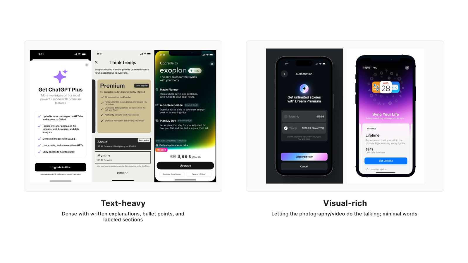
Text-heavy vs Visual-rich
"Scannable first, deep when I dig"
● Split (50/50)
Principle
Visuals help users build initial engagement; text serves rational judgment on demand — these are the same information need at different stages of the user journey.

This dimension forms a triangle with Need 4 (Simple vs Detailed) and Need 5 (Feature vs Scenario) — all three point to the same meta-pattern: users need visuals/simplicity at the scanning layer, and text/detail at the deep-dive layer. The V2 50/50 split doesn't mean users are indifferent; it means both layers are genuine needs.

Quantitative Distribution
V1 matrix (n=254)
63.4%
10.2%
26.4%
V2 slider (n=38)
42.1%
15.8%
42.1%
Visual-rich
Neutral
Text-heavy
User Voices

"I like the one on the right with less text. Too much text is overwhelming even for me, and I'm a reading teacher."

Age 45–54Income Over $100,000Sub $30–$39.99V1 cohort

"Sometimes, too much text can seem very confusing and cluttered and I prefer simplicity and visuals"

Age 35–44Income $25,000–$49,999Sub $20–$29.99V1 cohort

"I'd preferred the left description because it displays texting as an easier way to write a response"

Age 45–54Income $50,000–$74,999Sub $40+V1 cohort

"How can I really see what the hell I'm reading when I can't see the teeny ass word"

Age 35–44Income Less than $25,000Sub Under $10V1 cohort

"I prefer more details in my information page"

Age 45–54Income Over $100,000Sub $10–$19V1 cohort

"Text heavy, because it has more substance than the visual based option"

Age 35–44Income $50,000–$74,999Sub Under $10V1 cohort

"Love visual aides I understand faster when I see it with my eyes"

Age 45–54Income $25,000–$49,999Sub $10–$19V1 cohort

"Don't want that to read too much information"

Age 35–44Income $50,000–$74,999Sub $20–$29.99V1 cohort

"I like the text-heavy version more because it provides me with more relevant information about each of the app's features and functions."

Age 35–44Income $25,000–$49,999Sub $30–$39.99V1 cohort

"visual reach is more clear and easy to understand"

Age 35–44Income Over $100,000Sub $20–$29.99V1 cohort

"I am really good about learning from text but in situations like this visuals make it quicker and easier to understand what is being conveyed."

Age 45–54Income $25,000–$49,999Sub $20–$29.99V1 cohort

"Provides detailed information and are great for uses who prefer to read and fully understand the specifications, features, or instructions of a product or service."

Age 35–44Income Over $100,000Sub $30–$39.99V1 cohort

"The Scenario focused option is not as busy, easier to read and understand."

Age 45–54Income Over $100,000Sub $30–$39.99V1 cohort

"the number description doesn't match the picture but i'm going to assume the picture is what's relevant here and in this situation i'd prefer text heavy to get more info and visual rich if i just wanted a quick look"

Age 18–24Income Over $100,000Sub $40+V1 cohort

"Much prefer the image on the left as it’s more detailed"

Age 35–44Income $50,000–$74,999Sub $20–$29.99V1 cohort

"Prefer the left because there is more information"

Age 35–44Income $50,000–$74,999Sub $10–$19V1 cohort

"visual focus is more information to me. to me, this is considered evidence and we need this type of protection when we need to take the person to justice."

Age 35–44Income $75,000–$99,999Sub $10–$19V1 cohort

"I like the text-heavy one because it tells me everything exactly as it is. Leaves less room for confusion."

Age 35–44Income $50,000–$74,999Sub Under $10V1 cohort

"i prefer to read and have points than something i might not understand while been spoken out"

Age 18–24Income $50,000–$74,999Sub $30–$39.99V1 cohort

"I would prefer a balance of text and visuals to keep me engaged"

Age 25–34Income $25,000–$49,999Sub Under $10V1 cohort

"Visual-rich is better because most people won’t feel like reading constant text. They’ll eventually burn out and skim."

Age 25–34Income $25,000–$49,999Sub Under $10V1 cohort

"I’d much prefer to just be told in text what a product does"

Age 25–34Income $75,000–$99,999Sub $20–$29.99V1 cohort

"The text heavy version is too cluttered in my opinion, so the visual rich version looks very digestible and easy to comprehend if you’re just doom scrolling on your phone and want to buy something."

Age 18–24Income $25,000–$49,999Sub $10–$19V1 cohort

"I chose feature-focused because for a security app, I want detailed information and clarity over just visuals, although it should be easy to scan."

Age 25–34Income $50,000–$74,999Sub $10–$19V1 cohort

"I like the images with the text more because I can accurately understand what I am paying for."

Age 18–24Income Over $100,000Sub Under $10V1 cohort

"Text heavy is never a good thing, its confusing"

Age 18–24Income $50,000–$74,999Sub $20–$29.99V1 cohort

"I like the visual rich side way better too much information makes people zone out"

Age 18–24Income $25,000–$49,999Sub Under $10V1 cohort

"i think a balance needs to be found. too much text and i skim it but too little and i don’t know enough"

Age 18–24Income $50,000–$74,999Sub Under $10V1 cohort

"The text heavy one has more information but isn't too cluttered with words. It gives me enough information without going too overboard with the amount of words."

Age 25–34Income Less than $25,000Sub $30–$39.99V1 cohort

"Visuals catch my eye better than lots of words"

Age 25–34Income $50,000–$74,999Sub $10–$19V1 cohort

"Although both are good but personally I prefer the visual one better as text heavy is too much reading. I prefer watching a short video or diagram that explains everything."

Age 18–24Income $50,000–$74,999Sub $20–$29.99V1 cohort

"I prefer the second option because I don’t want to do a lot of reading. I would rather look at a picture and decide whether I want a subscription or not. Not having to read an entire paragraph. Also just having to read a bunch makes me less likely to want to buy it."

Age 18–24Income Less than $25,000Sub $10–$19V1 cohort

"I prefer the visual-rich because as I mentioned previously, too much reading can lose the reader."

Age 25–34Income $25,000–$49,999Sub $20–$29.99V1 cohort

"Text heavy so that i can see all the information i need to on the first page"

Age 25–34Income Over $100,000Sub Under $10V1 cohort

"I like it telling me what exactly it is without giving too much text"

Age 25–34Income Less than $25,000Sub $20–$29.99V1 cohort

"I prefer text heavy if I’m supposed to pay I want the information"

Age 25–34Income Over $100,000Sub $10–$19V1 cohort

"The visual rich side is less overwhelming so it’s easier to use"

Age 25–34Income Over $100,000Sub Under $10V1 cohort

"I'm split on this one just because I think you need to find a balance between text-heavy and visual-heavy. Like the previous question had too much text and details can be very overwhelming but also too-little will make me not understand why I really need to get the subscription. I think for this one a good balance between text and visual works well"

Age 18–24Income Over $100,000Sub Under $10V1 cohort

"As much as I enjoy heavy visuals and photos, I believe text and words are better than visuals when it comes to describing new innovative ideas."

Age 25–34Income $50,000–$74,999Sub $20–$29.99V1 cohort

"I prefer the visual because you can the gist of something without all the reading"

Age 25–34Income Over $100,000Sub $10–$19V1 cohort

"Visual rich is much more appealing, it grabs my attention and interests me more"

Age 18–24Income Less than $25,000Sub $20–$29.99V2 cohort

"like I mentioned earlier, simpler the better for me. When there’s a lot of text, I end up reading nothing."

Age 25–34Income Over $100,000Sub $10–$19V2 cohort

"I would prefer the visual subscriptions over the more heavy text oriented ones because I am personally teh type of person that needs to see visuals to keep my attention on a certain thing."

Age 18–24Income Less than $25,000Sub $20–$29.99V2 cohort

"I prefer visually appealing design's so this is why i have chosen it."

Age 35–44Income Over $100,000Sub $30–$39.99V2 cohort

"Typically a visual screen just has no information whatsoever. I prefer a balance between the two, leaning more towards text that provides relevant information."

Age 35–44Income $75,000–$99,999Sub Under $10V2 cohort

"I prefer the text heavy design on the subscription page. It helps with knowing for sure what you are signing up for without assuming because it is written and It will help in clearly seeing what I will be paying for. It feels transparent and honest and will also give a clear sense of expectations without assumption."

Age 25–34Income $25,000–$49,999Sub Under $10V2 cohort

"I prefer the text-heavy style a bit more because it clearly explains the features and pricing without guessing what's included."

Age 25–34Income $75,000–$99,999Sub $10–$19V2 cohort

"Text heavy looks “rich and professional”it definitely attract my mind first"

Age 45–54Income Less than $25,000Sub Under $10V2 cohort

"People tend to not be interested or quickly lose interest with text-heavy designs even though it is more informative. I prefer the visual rich because it is appealing and informative at the same time."

Age 18–24Income Less than $25,000Sub Under $10V2 cohort

"Although a bit overwhelming, I like that there’s a lot of detailed information that I can find comfort in"

Age 55–64Income Over $100,000Sub $10–$19V2 cohort

"Visual rich design looks like very attractive and trustworthy"

Age 35–44Income Over $100,000Sub $30–$39.99V2 cohort

"I don't want too much text before I've decided that I care. Once I care, then I'll take the time to read the text"

Age 55–64Income $50,000–$74,999Sub Under $10V2 cohort
Visual Stimulus
Text-heavy vs Visual-rich presentation style comparison
User Perspective
Users who prefer Visual-first value
  • Don't want heavy text consuming their attention before they've decided whether they're interested
  • Visuals help build product understanding quickly, lowering the entry barrier
  • High text density causes the brain to disengage — information overload leaves nothing retained
Users who prefer Text detail value
  • Security subscription is a rational decision — text communicates more precisely than visuals
  • Text makes inclusions and exclusions explicit, reducing ambiguity and guesswork
  • Feel confident enough to subscribe only after having complete written information
Researcher's Synthesis

Both cohorts show a near-even split between text-heavy and visual-rich preferences.

Users have competing needs. Text-heavy advocates value completeness, clarity, transparency, and leaving no room for confusion. Associating text with honesty and informed decision-making. Visual-rich advocates value speed, digestibility, reduced cognitive load, and designs that grab attention without feeling overwhelming.

Cohort 1's quantitative scale showed a clear preference for Visual Rich (64%), while Cohort 2's slider showed a near-perfect split (44% vs. 42%). Similar to Feature vs. Scenario, the slider format may have reduced hypothetical bias.

Neither approach fully satisfies all users. The optimal solution is a balanced approach: visual-rich design for first impressions and engagement, with clear, accessible text details for those who want to dig deeper. Progressive disclosure. Showing key information visually with options to expand for more detail may best serve both camps.

Tapo Care's Design Response
  • Above-the-fold uses visual elements (icons, images, color blocks) to build fast comprehension, minimizing above-fold text volume
  • Visual-first display; text detail expands on demand (progressive disclosure)
  • Icons and imagery carry explicit semantic meaning — each visual element communicates one clear information point, not pure decoration
  • Text sections are typeset for readability — appropriate line spacing and font size for fast scanning, avoiding dense paragraph blocks
  • Visuals and text have clear hierarchy in the information architecture — neither competes with the other for attention
Quant support: V1 matrix (n=254) favored Visual-rich 63.4% / Text-heavy 26.4%; V2 inverse slider (n=38) exact split: Text-heavy 42.1% / Visual-rich 42.1%. Same pattern as Feature vs Scenario dimension. No significant cohort variation; primary/secondary structure pending v1 behavioral data validation.
7
Abstract vs Explicit
"Premium feel, without losing clarity"
● Mixed
Principle
Users want a product that feels premium — but not at the cost of information clarity. Abstract handles the visual language; Explicit handles the primary information layer. The two can coexist.

This is the only genuinely "mixed" finding across all 7 dimensions. V1 favored Explicit (58.3%); V2 reversed to Abstract (44.7%), with the highest neutral rate of any dimension. Users have strong aversion to "gamified" or overly stylized design — but remain open to "restrained modern aesthetics."

Quantitative Distribution
V1 matrix (n=254)
22.4%
19.3%
58.3%
V2 slider (n=38)
44.7%
18.4%
36.8%
Abstract
Neutral
Explicit
User Voices

"I definitely prefer the abstract; the ones on the right felt gimmicky."

Age 45–54Income Over $100,000Sub $30–$39.99V1 cohort

"I prefer the explicit design - minimalist, easy on the eye, clear and straightforward"

Age 35–44Income Over $100,000Sub $20–$29.99V1 cohort

"Straight to the point. No room for misinterpretation"

Age 35–44Income Over $100,000Sub $10–$19V1 cohort

"I prefer the explicit option because I like knowing all of the important details right up front."

Age 35–44Income $25,000–$49,999Sub $30–$39.99V1 cohort

"I just prefer having direct and straightforward information"

Age 35–44Income Over $100,000Sub $20–$29.99V1 cohort

"explicit is more than attractive than other the interface is more informative"

Age 35–44Income Over $100,000Sub $20–$29.99V1 cohort

"The Explicit design is direct and uses literal imagery to clearly communicate who or what is involved. It depicts the person or device being focused on, making it easy to immediately understand the context and what the app is trying to show."

Age 35–44Income Over $100,000Sub $30–$39.99V1 cohort

"The explicit option is easier to read and understand."

Age 45–54Income Over $100,000Sub $30–$39.99V1 cohort

"I like the abstract because it looks more pleasing"

Age 25–34Income $50,000–$74,999Sub $30–$39.99V1 cohort

"Its a vibe nobody wants to be bombarded with a bunch of gamey aesthetics when looking for a subscription this is not a game it should feel explicit and grown."

Age 18–24Income $25,000–$49,999Sub $20–$29.99V1 cohort

"As the name stated, the explicit content seems appropriate and makes me understand the product more."

Age 35–44Income $75,000–$99,999Sub $10–$19V1 cohort

"I prefer explicit because it’s not too wordy and it’s too the point of the information needed to convey to the consumer."

Age 25–34Income $25,000–$49,999Sub Under $10V1 cohort

"I chose 2 because the left description feels slightly more engaging and clear than the right. However, it still needs improvement to fully capture my preference."

Age 18–24Income Over $100,000Sub $20–$29.99V1 cohort

"The Explicit one looks a lot more fun, and convincing to join the subscription. I think the majority of what’s important to get a subscriber, is the marketing strategy, and how the design looks."

Age 18–24Income $25,000–$49,999Sub $10–$19V1 cohort

"I prefer a more explicit design because it clearly shows what the product does and how it helps in real life situations."

Age 25–34Income $50,000–$74,999Sub $10–$19V1 cohort

"I like a more direct approach to information"

Age 18–24Income $25,000–$49,999Sub Under $10V1 cohort

"I prefer the abstract because it is more detailed"

Age 25–34Income $50,000–$74,999Sub $10–$19V1 cohort

"I think explicit would make it clearer so I prefer it"

Age 35–44Income Over $100,000Sub $30–$39.99V1 cohort

"My preference is abstract because it’s more pleasing to look at"

Age 25–34Income Less than $25,000Sub $20–$29.99V1 cohort

"Honestly more neutral for this one but i’m leaning more left/ abstract. The right feels too AI and the left is just more artsy"

Age 25–34Income Over $100,000Sub Under $10V1 cohort

"The abstract is fun, but it can also be confusing at times"

Age 25–34Income Over $100,000Sub $10–$19V1 cohort

"It’s much more direct which I appreciate"

Age 18–24Income Less than $25,000Sub $20–$29.99V2 cohort

"I would go with Abstract because it looks more premium, modern and gives the app a more polished feel"

Age 25–34Income Over $100,000Sub $20–$29.99V2 cohort

"I am neutral for this concept design because to me both look good."

Age 18–24Income Less than $25,000Sub Under $10V2 cohort

"I feel comfortable with seeing facts up front. Not vague or open to interpretation"

Age 55–64Income Over $100,000Sub $10–$19V2 cohort

"Better to be concrete in terms of home security rather than a vibe"

Age 18–24Income Less than $25,000Sub $10–$19V2 cohort

"I like the explicit side that gets right to the point, and it is interactive to the point of it keeping my attention with a simpler approach."

Age 18–24Income Less than $25,000Sub $20–$29.99V2 cohort

"I like the abstract style more. It feels cleaner, more modern, and fits a security app without looking too busy"

Age 25–34Income $75,000–$99,999Sub $10–$19V2 cohort
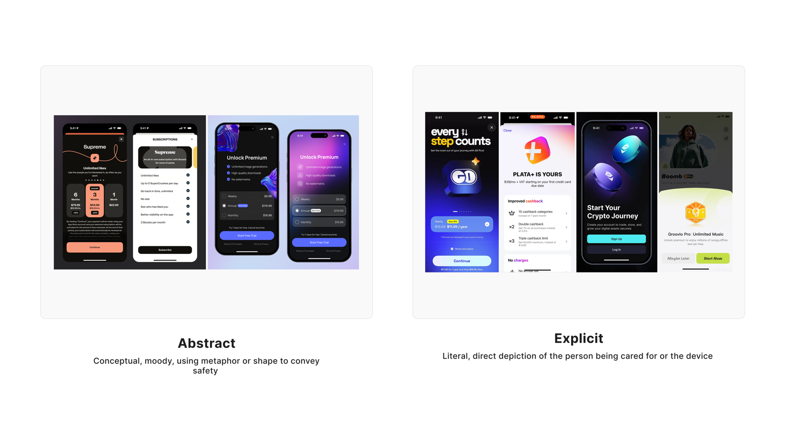
Visual Stimulus
Abstract vs Explicit visual style comparison
User Perspective
Users who prefer Abstract value
  • Modern feel and premium quality — restrained visual language conveys professionalism
  • Over-stylized design (gamified, flashy) is inappropriate for a security context
  • (More common among higher-income users and those with quality expectations)
Users who prefer Explicit value
  • Direct information — no interpretation or guessing required
  • In a security context, "being understood" is itself a source of trust
  • (More common among older users and those who prioritize practical information)
Researcher's Synthesis

The original research report did not produce a standalone key-finding paragraph for the Abstract vs. Explicit dimension — responses across both cohorts did not converge on a directional conclusion strong enough to support an independent finding. The design response below is derived from the quantitative distribution, user verbatim quotes, and product perspective taken together.

Tapo Care's Design Response
  • explores both paths in parallel: Explicit as the primary information layer (clear benefit descriptions), Abstract as the visual language (white space, modern aesthetics, restrained color)
  • Action copy is direct and behavioral (e.g., "Subscribe to Basic"); benefit descriptions are specific and quantifiable
  • Visual layer stays restrained — white space increases perceived quality; avoid over-decoration
  • Avoid gamified or aggressively stylized elements (high-contrast color combinations, badge stacking, animation overload)
  • Abstract vs Explicit A/B test is included in the v1 follow-up plan, with conversion rate as the primary metric
Quant support: V1 matrix (n=254) favored Explicit 58.3% / Abstract 22.4%, neutral 19.3%; V2 inverse slider (n=38) reversed: Abstract 44.7% / Explicit 36.8%, neutral 18.4%. Highest neutral rate of all 7 dimensions — confirming genuine mixed signal. Significant subscription tier effect: lower tier (<$20) favored Abstract 32.7% vs higher tier ($20+) only 16.0% (16.7pp gap — potential monetization signal).

Cross-Cutting Insights

1. Progressive disclosure is the unified answer across all 7 dimensions

User comments across Need 4 (Simple vs Detailed), Need 5 (Feature vs Scenario), and Need 6 (Text vs Visual) appear, on the surface, to be picking sides between A and B. But reading carefully reveals they're all saying the same thing: give me a lightweight default, and let me find depth when I need it. This is the design logic of progressive disclosure — not a compromise, but a mapping to users' actual mental models. The V2 quantitative data shows 50/50 splits across all three dimensions, further confirming that "users on both ends exist, and design must serve both" is the correct conclusion.

2. Age as a moderator of information density tolerance

Two dimensions show significant age differences: in Simple vs Detailed, users 35+ favor Detailed (74.7% vs <35's 59.0%, a 15.7pp gap); in Feature vs Scenario, users 35+ favor Scenario (65.6% vs <35 who favor Feature, a 13.6pp gap). Both differences point in the same direction: older users need more contextual information to form a judgment; younger users prefer high-efficiency feature scanning. The design implication is that progressive disclosure's "expand" entry points must be prominent enough for 35+ users — they cannot be buried in corners requiring active searching.

3. Hypothetical bias in quantitative ratings

6 of the 7 dimensions in this study show V1 vs V2 preference direction differences of ≥10pp. The most striking are Intuitive/Emotional (V1 favored Emotional 53.5% → V2 favored Intuitive 68.4%) and Real Photos/Illustrations (V1 favored Illustrations 52.8% → V2 favored Real Photos 65.8%). The matrix presentation format tends to amplify social desirability bias — participants give "idealized" answers rather than true preferences. This is the methodological reason this report prioritizes user verbatim quotes over rating percentages: the language users use to describe their own behavior reflects actual decision logic more faithfully than scale ratings.

Recommendations

Need / Pattern Recommendation Priority Validation
Need 1 · Real Photos · Strong consensus Use authentic home environment photography as the primary visual; avoid illustrations and AI-generated figures P0 Done by research
Need 2 · Intuitive · Strong consensus Copy directly describes benefits; remove all fear/anxiety language; subscription and cancellation paths are transparent P0 Done by research
Need 3 · Comparative · Strong consensus Subscription plans default to side-by-side comparative layout; differentiation points are explicitly marked P0 Done by research
Need 4 · Simple vs Detailed · Medium consensus Concise above-fold overview + expandable detail entry points; 35+ user path: detail entry points are prominently placed P0 Usability test
Need 5 · Feature vs Scenario · Split (50/50) Feature list as primary layer; scenario examples as secondary layer; explicit correspondence between the two P1 Behavioral data
Need 6 · Text vs Visual · Split (50/50) Visual-first for initial impression; text detail expands on demand; icons carry explicit semantic meaning P1 Behavioral data
Need 7 · Abstract vs Explicit · Mixed explores both paths in parallel: Explicit as primary information layer, Abstract as visual language P1 Usability test + A/B experiment
Cross-cutting · Progressive disclosure adopts progressive disclosure information architecture site-wide, unifying the implementation logic across Needs 4/5/6 P0 Usability test
Monetization hypothesis Abstract aesthetics as a standalone A/B experiment for upgrade-trigger effect on lower-tier users P2 A/B experiment

Full Report

Open in Figma ↗